SVG Optimization
Sunday, September 28 2014
SVG images are pretty awesome. However, just like anything else on the web they should be optimized for size and displayability, and that’s when things get decidedly less awesome.
But fear not! After reading this post, you’ll be an SVG-optimizing wizard!
SVG stands for Scalable Vector Graphics: it’s an XML-based image format that interoperates well with HTML and CSS. That means you can do some cool stuff like have animated or interactive images, and it scales to any display size. Let’s see your grandma’s GIFs do that.
Naturally, whenever I have to do any sort of image work on the web I first think about whether I can make an SVG. They work well for logos (such as the one for this blog), icons, and a whole host of other visual elements. If you’re not convinced yet, you can learn a whole lot more about SVGs on the web from this comprehensive article.
When I first started working with SVG, I didn’t even consider optimization; I’d simply export images from Illustrator or Inkscape and use them as-is. Then I happened to crack one open in a text editor and saw a bunch of horrendous gunk like inkscape: and sodipodi, not to mention a barf of metadata. Turns out all this information is absolutely useless and can be optimized away. It also turns out that you can do a lot of interesting path fiddling and layout optimizations to crush the file size down even more. There are generally two ways to go about it:
- Use a command-line tool like SVGO. SVGO in particular was really handy for a time that I had to crunch 421 SVGs at once.
- If you want more fine-grained control, use a visual optimizer. I really recommend this one because if you know what you’re doing you can also mess with the SVG elements in edit mode.
Here’s the problem though: XML is absolutely, unequivocally, the worst document format ever devised by any living species in the history of the universe. If you want to torture yourself, try writing an XML parser (don’t forget to support namespaces!). It’s no wonder, then, that SVG optimization is notoriously hard to get right.
The Acid Test
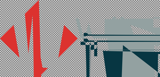
Ideally, optimization should shrink the size of the file without changing its visual appearance, so I have a test for whether my SVGs have made it through optimization unscathed. It’s called Ubuntu Image Viewer, though I’m sure equivalent programs on OSX and Windows will suffice. Here’s what an optimized SVG usually looks like in Image Viewer:

Eww! What the heck happened? Oddly enough, if I open this file in Google Chrome or Inkscape it renders totally fine. But sometimes the SVG is corrupted and missing components in Inkscape, and sometimes it even fails to render properly in Chrome. Like I said, XML.
You might be tempted to say, “Well, if it looks okay in Chrome that’s all that matters, right?” And you’d be right, except for the fact that dinosaurs like IE9 and Opera exist. Who knows what my SVGs look like on those things?
The Hard Way
Yep…if we’re going to do this right, we have to do it the hard way: manually. Here are some loose rules for manually optimizing SVGs that are now part of my workflow:
- Flatten all groups. Editors like Inkscape love to attach any transforms to groups when they can, and that’ll lead to some really gnarly code. You can always regroup later.
- Trim SVG to contents. You want your image to start at the origin
(0, 0)and the artboard to fit snugly on all four sides. Use
viewBox. My<svg>tag always looks like this:<svg xmlns="http://www.w3.org/2000/svg" viewBox="0 0 X Y">where
XandYare the width and height of the image, respectively. That’s all you need, nothing else.- Remove useless top-level elements. You don’t need
sodipodiandmetadata. If you have gradients or effects, you will need a fewdefsto describe them, but for a flat image you can get rid ofdefstoo. - Get rid of
id. Unless you have gradients or plan to manipulate your SVG from JavaScript or CSS, you don’t need to tag specific elements. - You usually don’t need
style. Inkscape shoves a bunch of junk into thestyleattribute of paths and shapes, especially if you’ve converted fonts into paths. Use your judgment here, but you really only need to describe the fill colorfilland opacityfill-opacity. - Group liberally. Now that you’ve flattened groups, you can merge paths as you see fit into groups based on common fill color, etc. This means you can also delete the relevant common attributes.
Whew, that was a lot! Now here are some hard rules you should always abide by:
- Absolute coordinates: If you ever have to tweak SVG paths by hand, relative coordinates suck.
- Precision isn’t important: Why SVG editors save coordinates up to 6 decimal places, I will never know. Unless you plan on making an Earth-sized display, 3 decimal places is enough.
In Inkscape, you can configure these rules by going to File, Inkscape Preferences..., SVG output. Apply the following changes:
- Uncheck “Allow relative coordinates”
- Set “Numeric precision” to 3
- Set “Minimum exponent” to -3
You should also uncheck “Use named colors” and check “Inline attributes” to shave a few bytes off.
That’s all I have for now. I wish you well in your SVG travels.
Comments
comments powered by Disqus